Through The Archway: The Local Artist Who Created The FQP Logo
We are rather fond of our Friends of Queen’s Park logo. It scales up, it scales down. It works black on white, or white on black. It has a simple, sophisticated design with a timeless quality that holds within it the essence of the park that inspired it.
“a simple, sophisticated design with a timeless quality”
FQP was established in the 1980s, but it wasn’t until 1995 that chair Mag Morris recognised the need for a logo, and she had just the man for the job: her husband Peter.
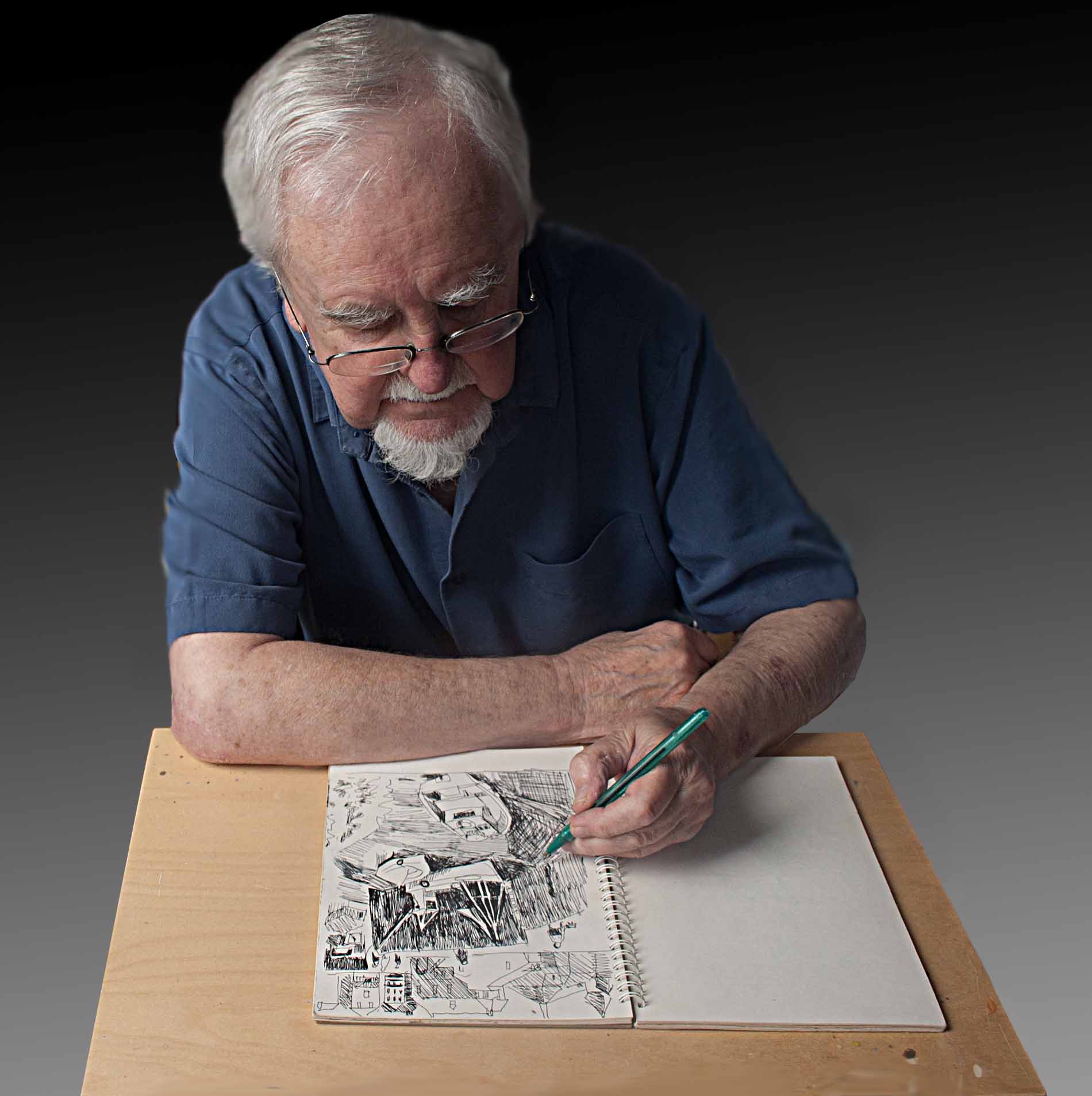
Peter Morris: artist at work
Then in his sixties, Peter was enjoying a busy retirement after a long and distinguished career as a graphic designer, a job which had taken him from art school in Cardiff to Montreal, London and eventually Brighton. His CV included a stint in the aircraft industry and running a successful design studio. Many local people know Peter for his oil painting – ‘a pernicious habit which I still practise’ – portraying everyday scenes seen through his own distinctive prism. “I ended up at the University of Sussex as graphic designer, then departmental manager. I am now fully retired, though enslaved by my painting. I’ve done some Open Houses and exhibited here and there [including the Montreal Museum Of Fine Art] and sold a few.”
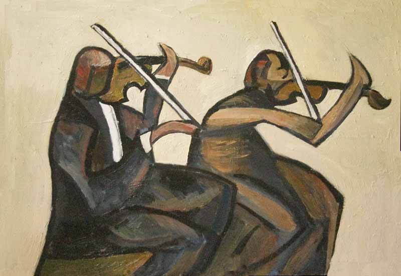
Violinists by Peter Morris
FQP was indeed fortunate to have someone so well qualified for the task of designing its logo. “Having been educated at a traditional art school – the world of life drawing, anatomy, perspective and the like – my drawing style was what we irreverent students called “chopped hay”, depicting light and shade using a soft pencil. In a pre-computer drawing office, the medium was the 7H pencil, which dispensed a barely visible thin line. This turned me on to line drawing, so-called ‘basic design’.”
“The envelope on whose back was scribbled the initial design for the FQP logo has long since gone to the rubbish dump,” says Peter. But he does recall how his creative thoughts were guided by his fondness for the park itself.
“Perhaps the components of the design were influenced by my address – 1 West Drive – which nestles in the shadow of the Queen’s Park arch at the top of Egremont Place. The little tree framed by the archway is what I see every time I come up the hill, and, as you know, it is obviously a feature of the park itself.”
Sandra Magson, former FQP chair, welcomed the arrival of Peter’s logo:
“Queens Park is Grade 2 Listed [since 1999] and its current charm owes much to its historic beginnings. The logo, representing in clean, modern design one of the original features of the park, acknowledges the importance of balancing history with the changing needs of current park users.”
Now 83, Peter and wife Mag still live on the park, where their contribution remains warmly appreciated.